|
|
| Author |
Message |
Zehava
Group: Banned
Joined: 15 Apr 2009
Posts: 50
Gold: Locked
Clan: Design Inc.

Status:
Warn: Banned
Reputation: 1

|
 #1 Posted: 15 Apr 2009 09:01 pm Post subject: My new signature #1 Posted: 15 Apr 2009 09:01 pm Post subject: My new signature |
 |
|
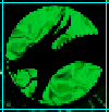
please criticism and rate it 1-10
_________________
This user's signature has been disabled |
|
| Back to top |
|
 |
Noctres
Group: Members
Joined: 15 Dec 2008
Posts: 1291
Gold: 2325.75
Clan: The Dude Abides
Status:
Warn: 
Reputation: 29
|
| #2 Posted: 15 Apr 2009 09:09 pm Post subject: |
|
|
defenatly a colorful image lol.
kinda reminds me of splatterhouse from the old TG-16..........but thats a side-thought.
i like it, though it could use a bit more flow, cant tell if im supposed to focus on the left/right borders or the center between the 2 light sources.
the 2 white splatters also steal focus as well
overall id say 7/10
_____________________
|
|
| Back to top |
|
|
|
|
Zehava
Group: Banned
Joined: 15 Apr 2009
Posts: 50
Gold: Locked
Clan: Design Inc.
Status:
Warn: Banned
Reputation: 1
|
| #3 Posted: 15 Apr 2009 09:11 pm Post subject: |
|
|
| Noctres wrote: | defenatly a colorful image lol.
kinda reminds me of splatterhouse from the old TG-16..........but thats a side-thought.
i like it, though it could use a bit more flow, cant tell if im supposed to focus on the left/right borders or the center between the 2 light sources.
the 2 white splatters also steal focus as well
overall id say 7/10 |
Thanks will post some of my old for you to comment.


Last edited by Zehava on 15 Apr 2009 09:13 pm; edited 1 time in total
_________________
This user's signature has been disabled |
|
| Back to top |
|
|
Noctres
Group: Members
Joined: 15 Dec 2008
Posts: 1291
Gold: 2325.75
Clan: The Dude Abides
Status:
Warn:
Reputation: 29
|
| #4 Posted: 15 Apr 2009 09:16 pm Post subject: |
|
|
| Zehava wrote: | | Noctres wrote: | defenatly a colorful image lol.
kinda reminds me of splatterhouse from the old TG-16..........but thats a side-thought.
i like it, though it could use a bit more flow, cant tell if im supposed to focus on the left/right borders or the center between the 2 light sources.
the 2 white splatters also steal focus as well
overall id say 7/10 |
Thanks will post some of my old for you to comment.
|
1st 2 i like alot, good design, flow, and excelent use of blending/lighting
3rd doesnt really count much since its just a colored c4d :p
to you have/use a tablet? or were those 1st 2 pentooled/c4d'd?
_____________________
|
|
| Back to top |
|
|
Nate
Forum Police!

Group: Retired Moderators
Joined: 13 Jul 2008
Donor: 
Posts: 8615
Gold: 2007.49

Status:
Warn:
Reputation: 152

|
| #5 Posted: 15 Apr 2009 09:16 pm Post subject: |
|
|
Very nice.. I like it. 6-10 imo.. 
_____________________
|
|
| Back to top |
|
|
Zehava
Group: Banned
Joined: 15 Apr 2009
Posts: 50
Gold: Locked
Clan: Design Inc.
Status:
Warn: Banned
Reputation: 1
|
| #6 Posted: 15 Apr 2009 09:18 pm Post subject: |
|
|
| Noctres wrote: | | Zehava wrote: | | Noctres wrote: | defenatly a colorful image lol.
kinda reminds me of splatterhouse from the old TG-16..........but thats a side-thought.
i like it, though it could use a bit more flow, cant tell if im supposed to focus on the left/right borders or the center between the 2 light sources.
the 2 white splatters also steal focus as well
overall id say 7/10 |
Thanks will post some of my old for you to comment.
|
1st 2 i like alot, good design, flow, and excelent use of blending/lighting
3rd doesnt really count much since its just a colored c4d :p
to you have/use a tablet? or were those 1st 2 pentooled/c4d'd? |
Mainly pentooled and yah 3rd sucks but thought I would post.
Will post more prolly tomorrow.
_________________
This user's signature has been disabled |
|
| Back to top |
|
|
|


